Visual Identity & Creative Strategy for Amway NAGC Whistler 2026
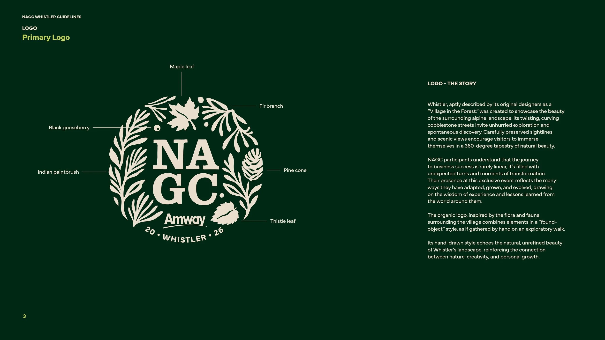
Whistler, often described as a “Village in the Forest,” inspired the brand identity for Amway NAGC 2026, an event celebrating leadership, growth, and connection amidst nature’s grandeur. The design draws on the alpine village’s winding streets, evergreens, and panoramic mountain views, a setting that mirrors the journey of Amway’s top leaders: non-linear, ever-evolving, and filled with discovery.
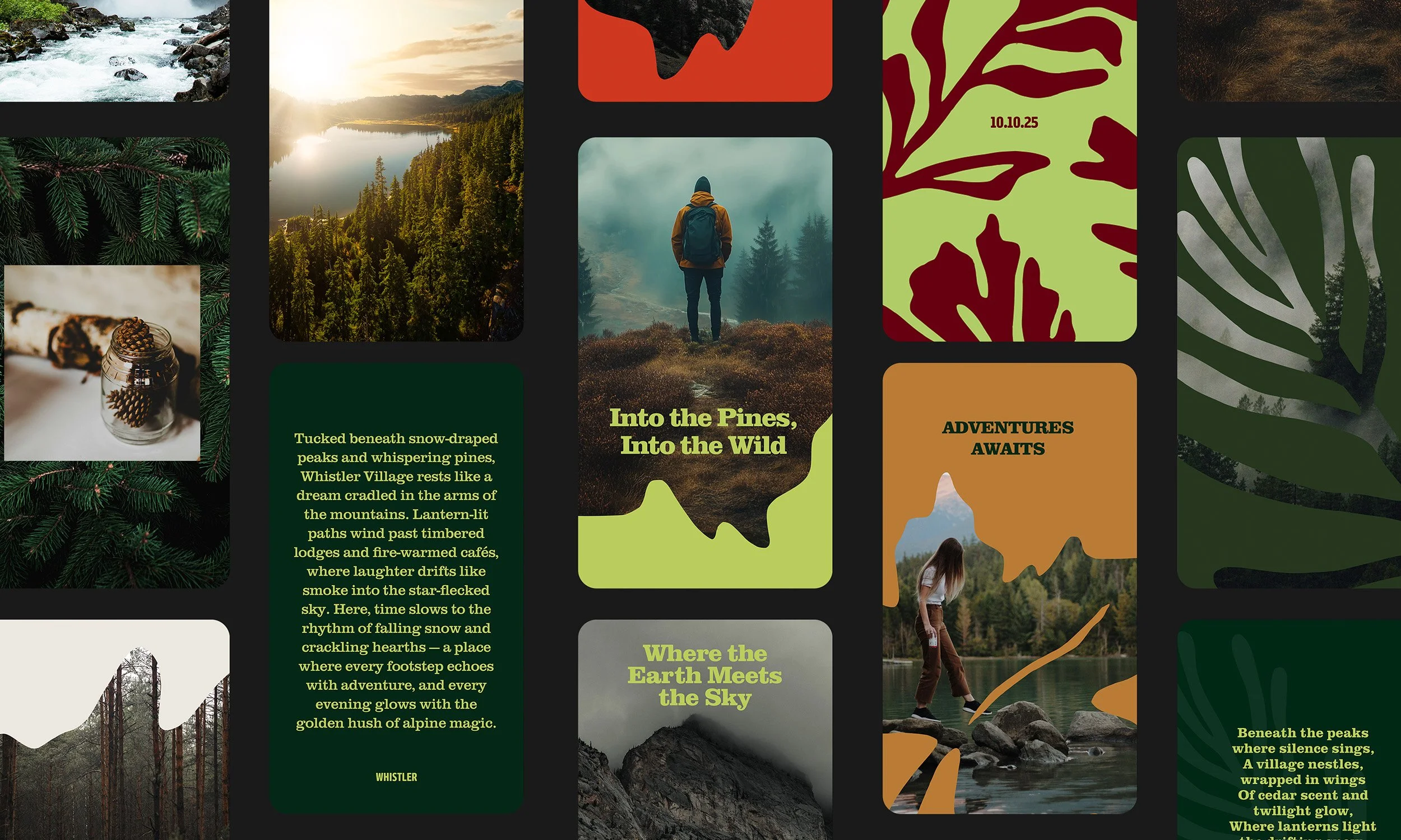
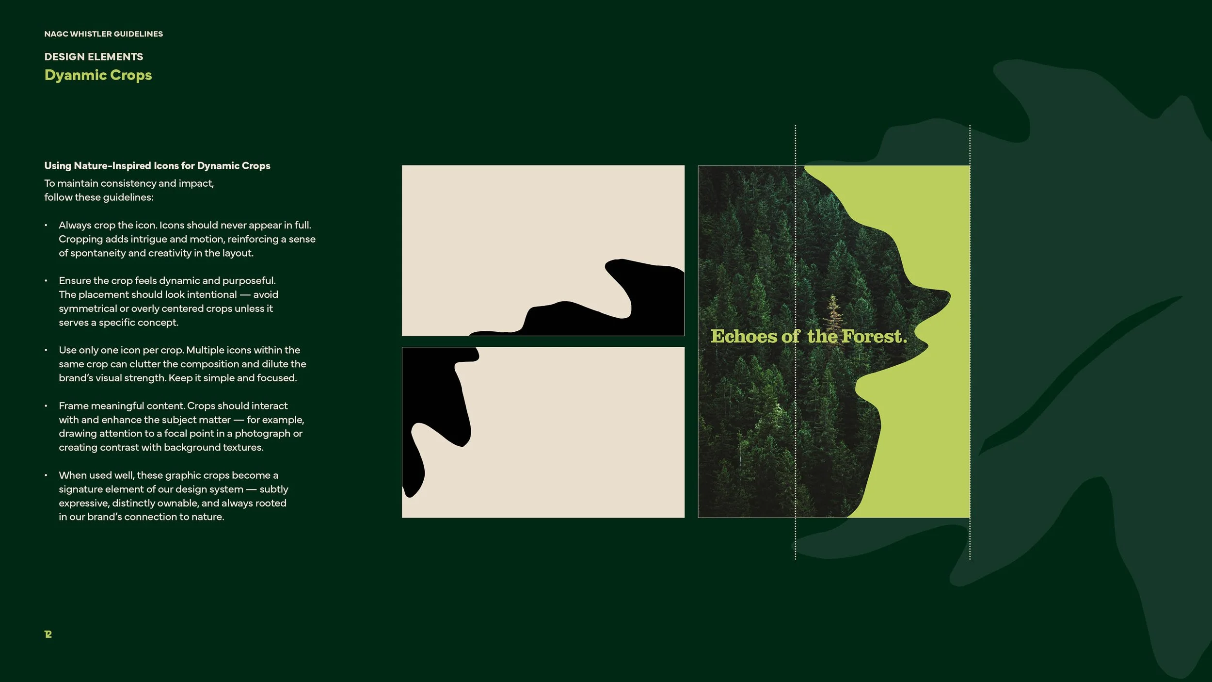
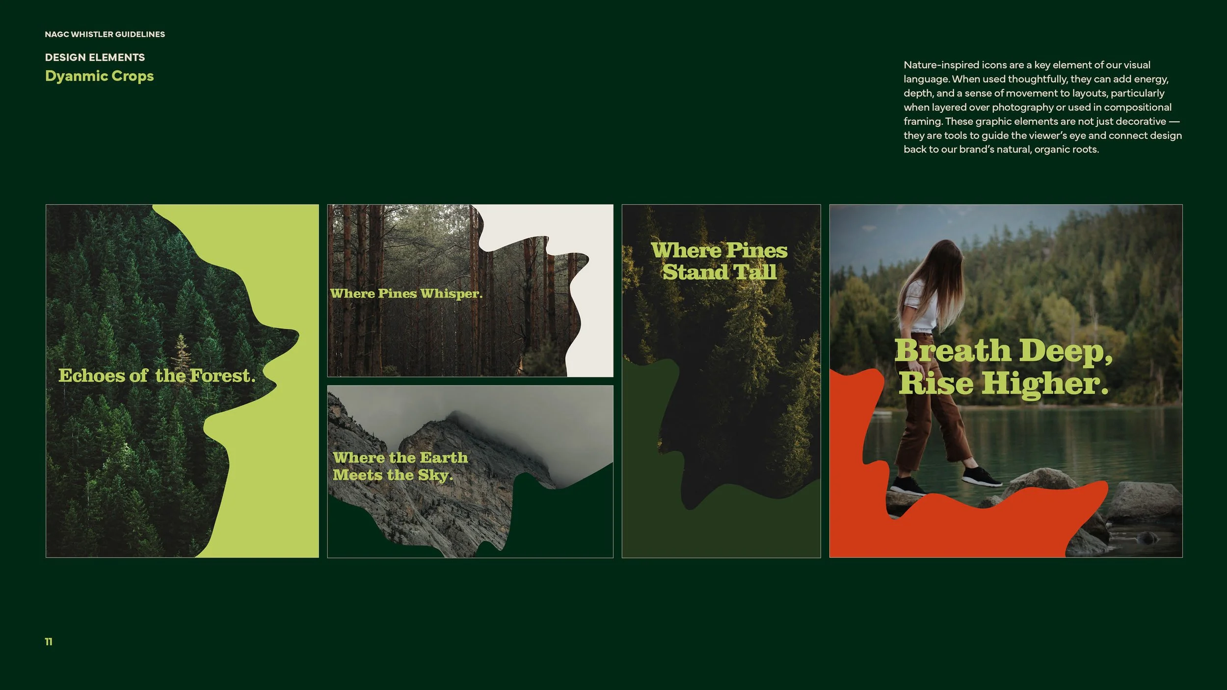
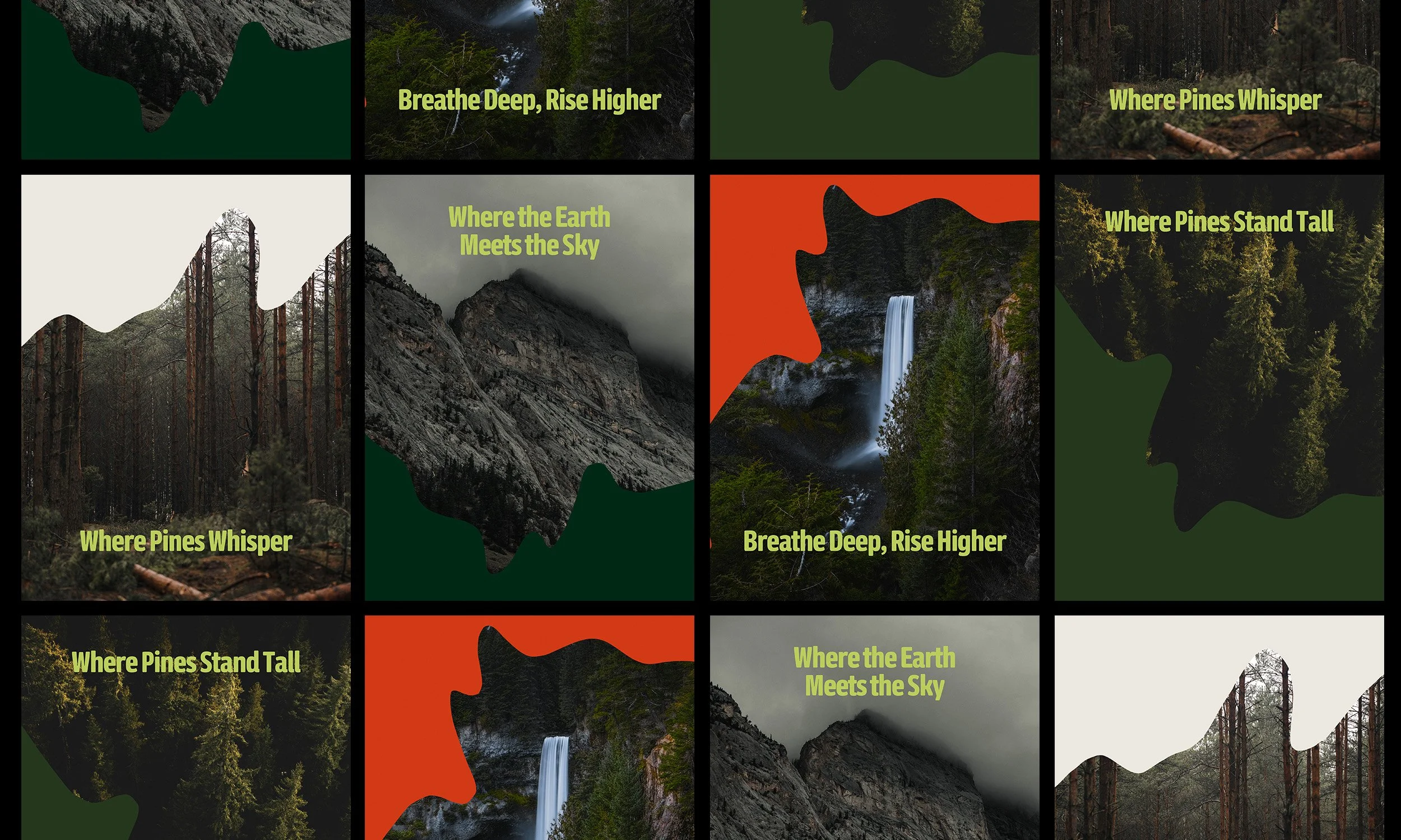
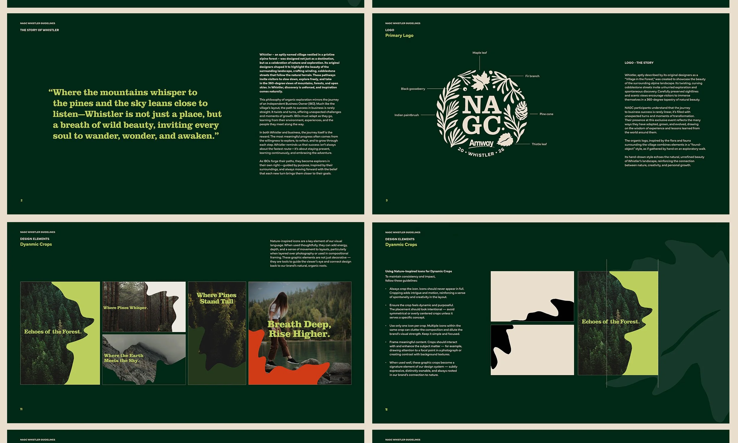
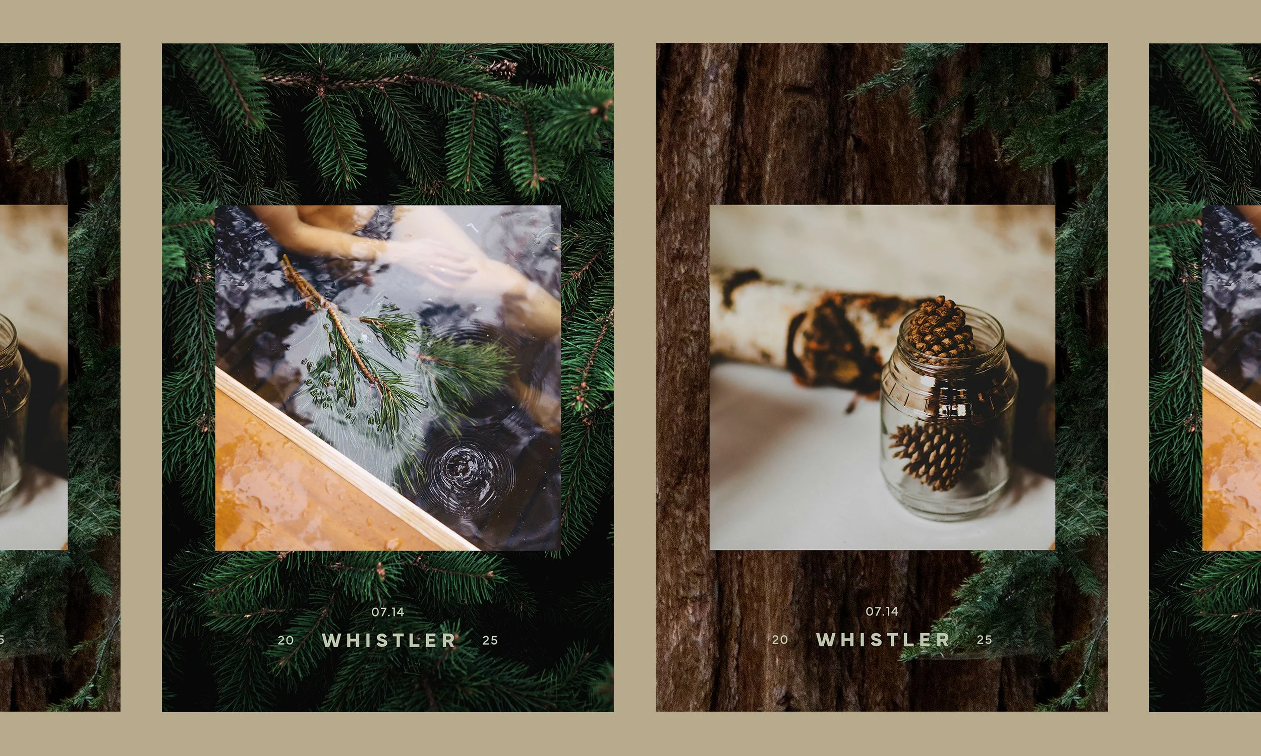
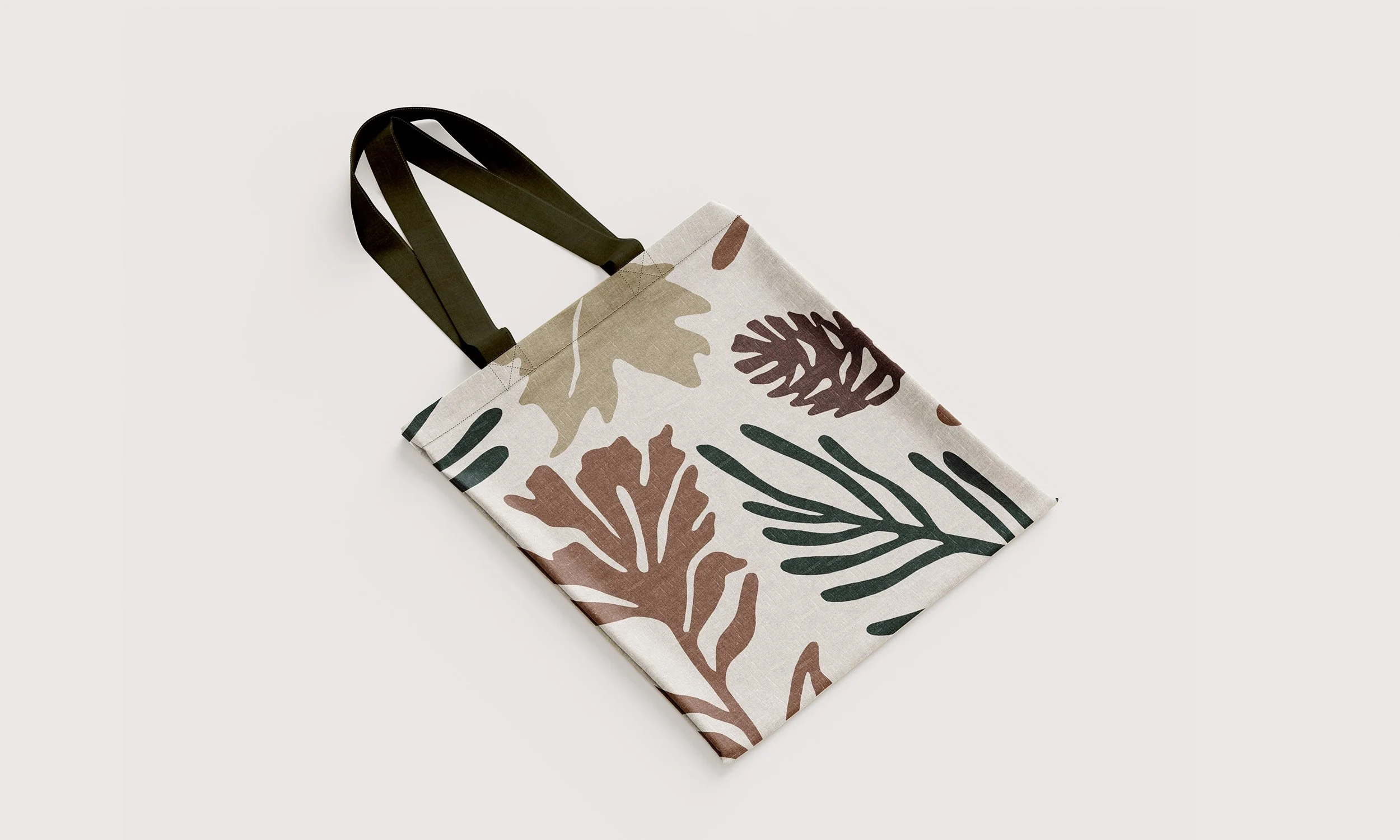
The creative direction captures the organic rhythm of Whistler’s landscape, balancing stillness and movement through flowing forms and layered silhouettes. The visual language draws from forest textures and natural patterns, pine needles, leaves, and stone, creating a tactile, grounded sensibility that feels both modern and timeless.
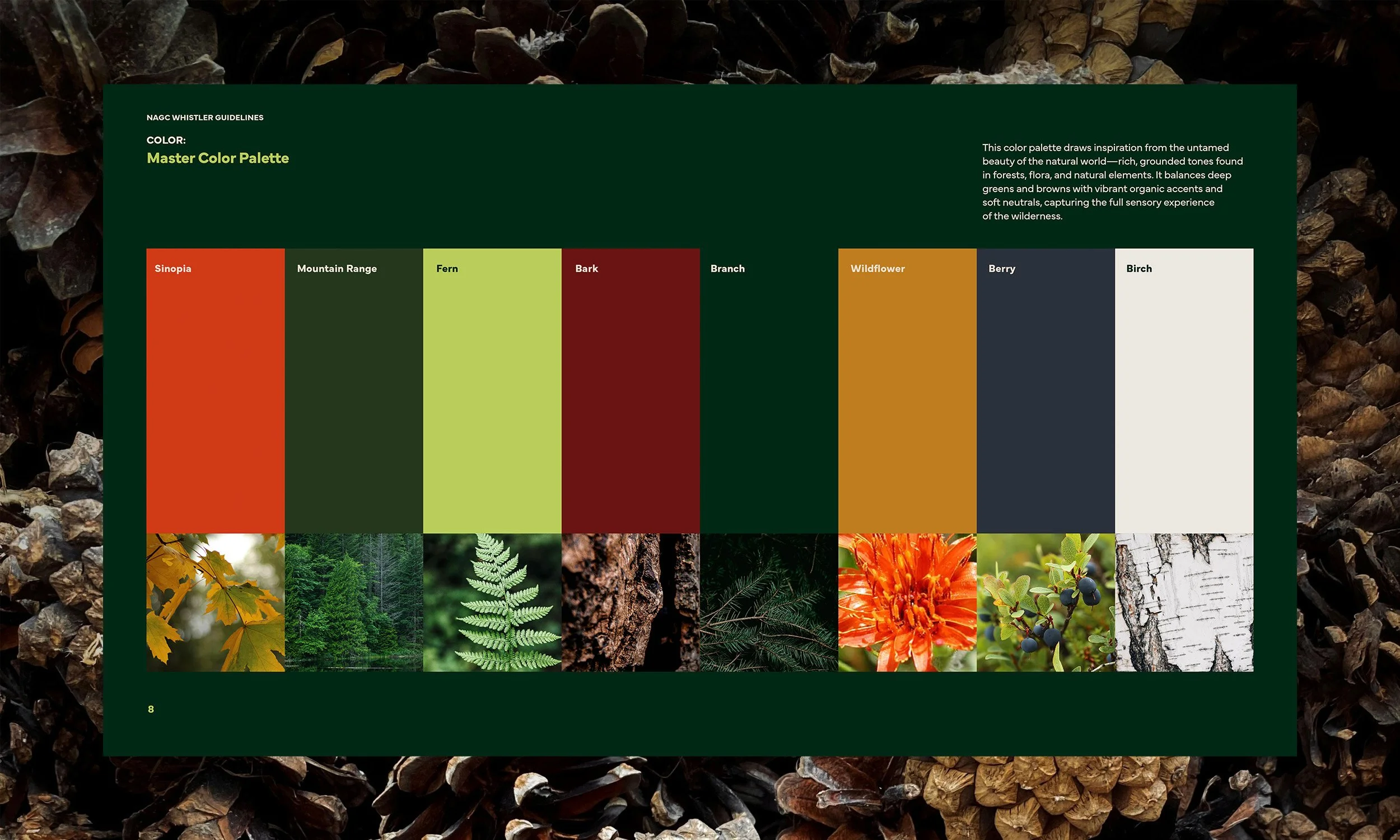
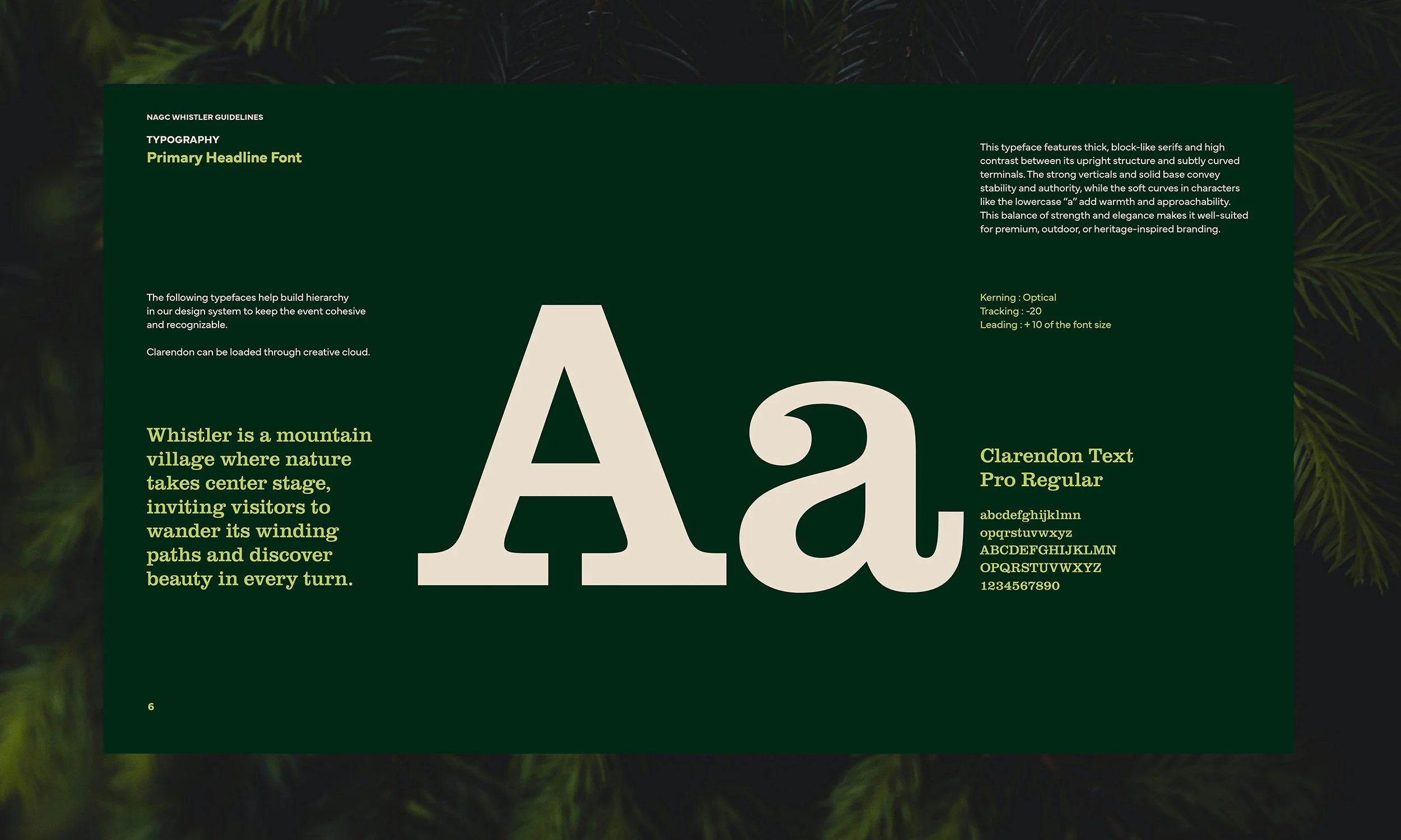
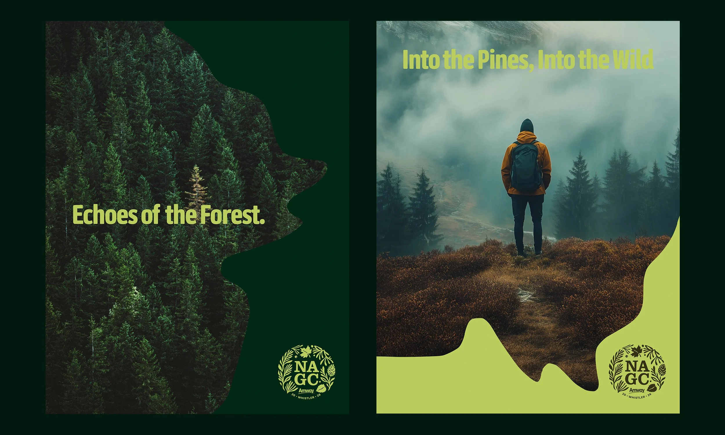
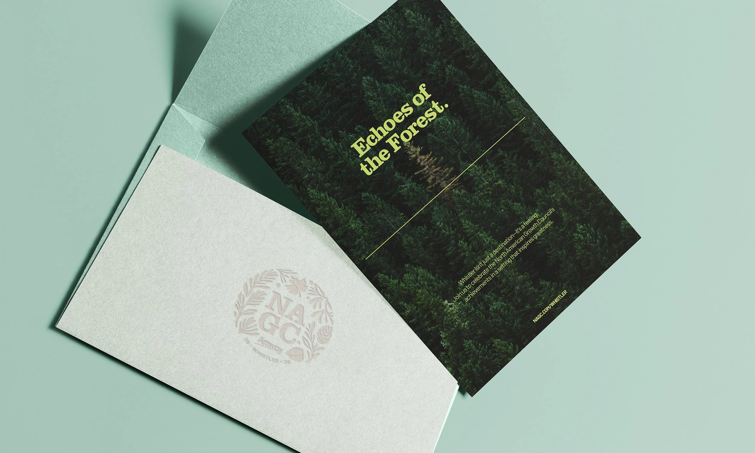
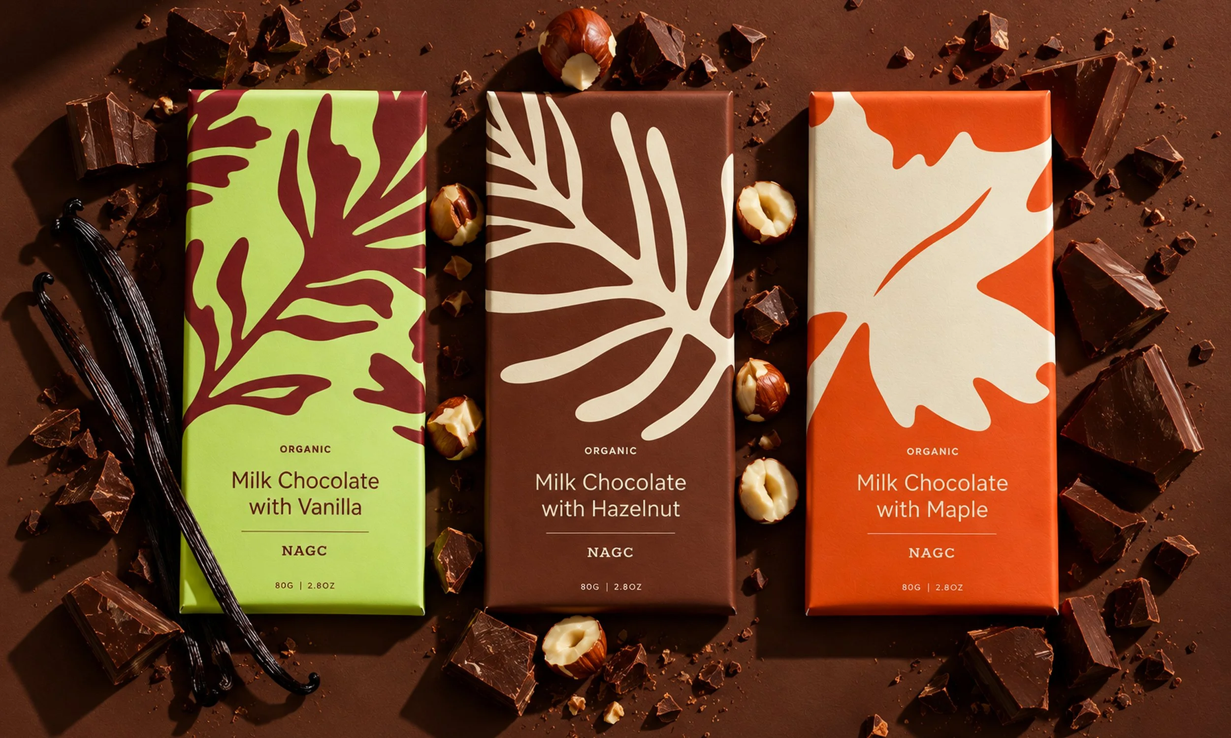
Typography and color choices further reflect the environment: earthy greens, deep burgundies, and warm neutrals paired with bold typographic statements that echo the spirit of exploration and achievement.
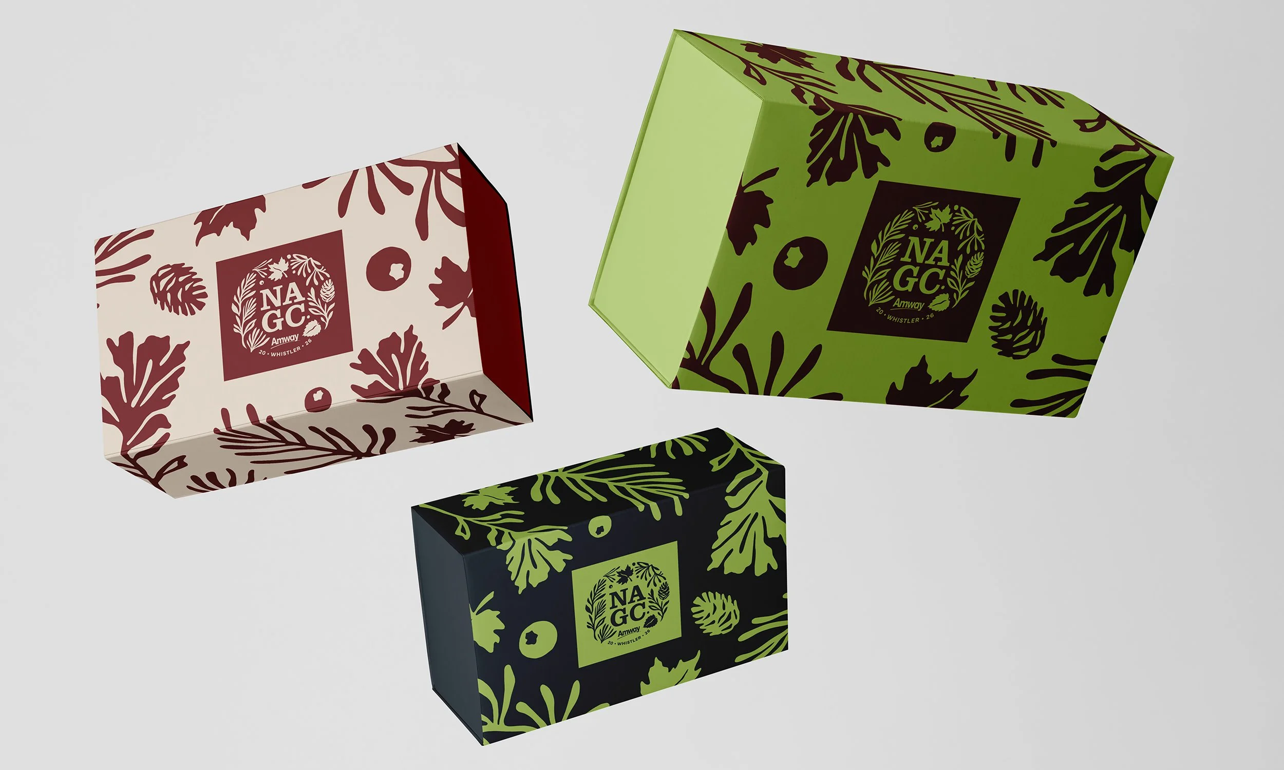
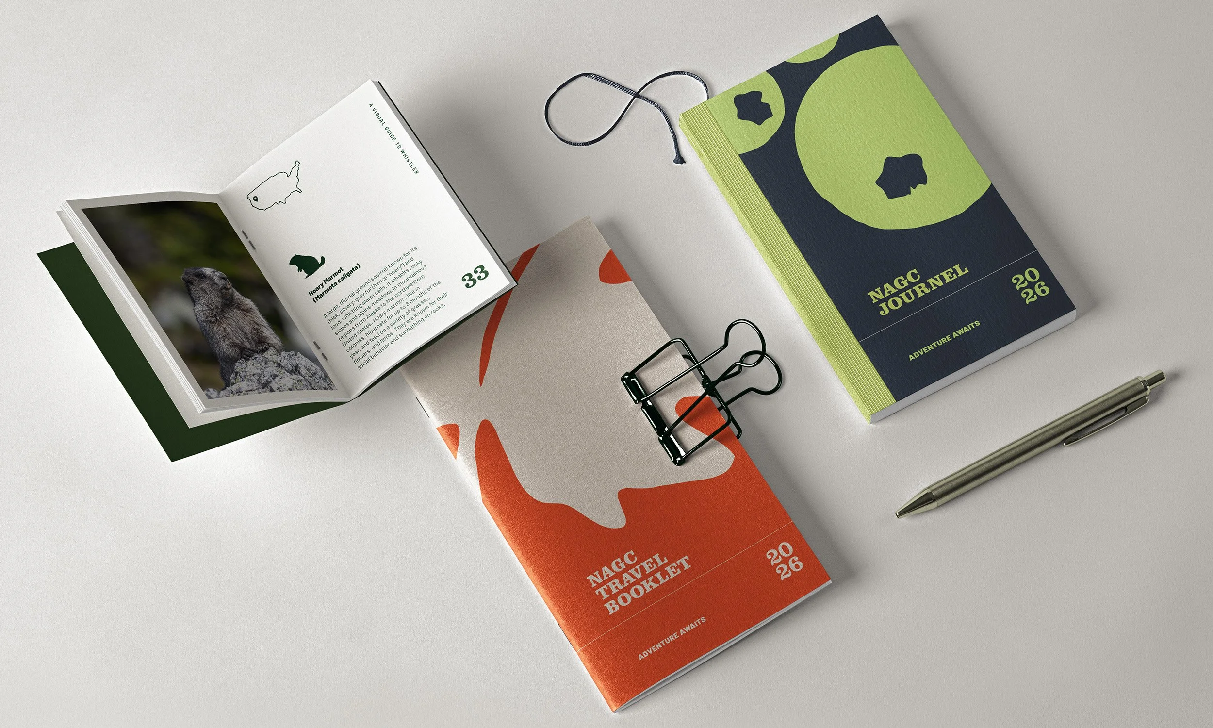
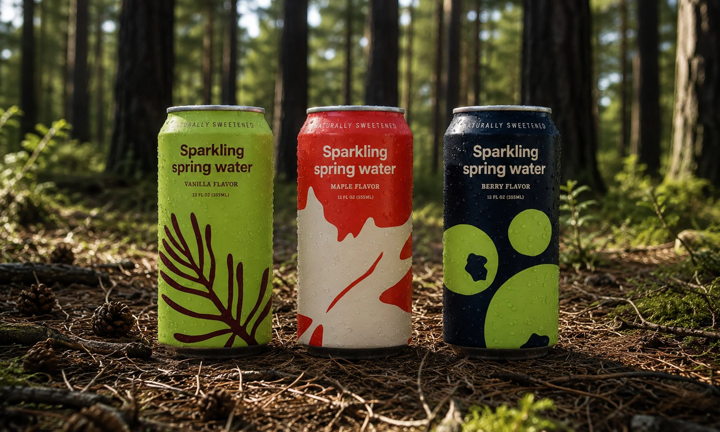
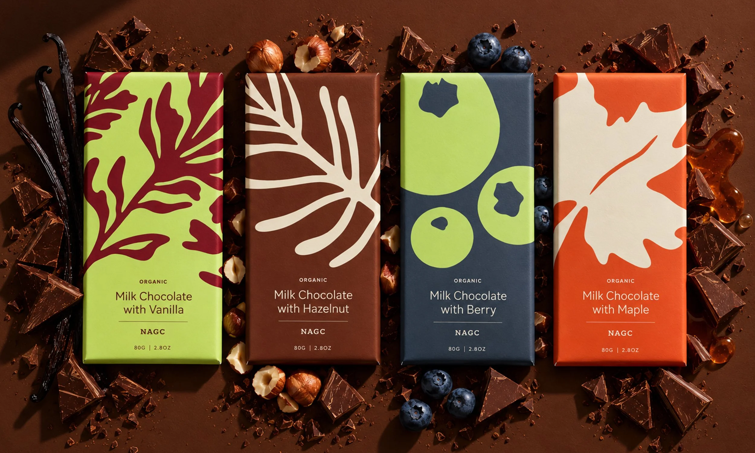
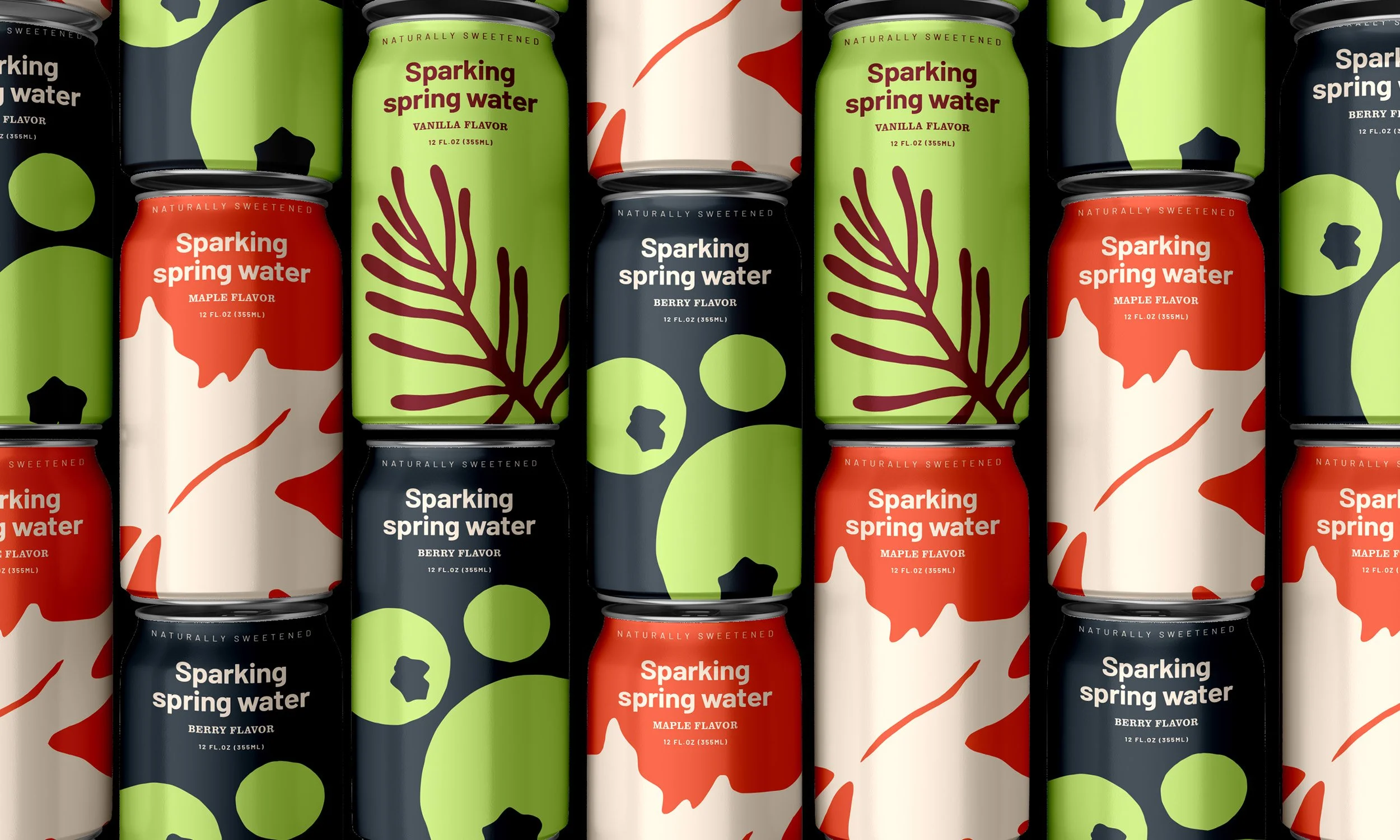
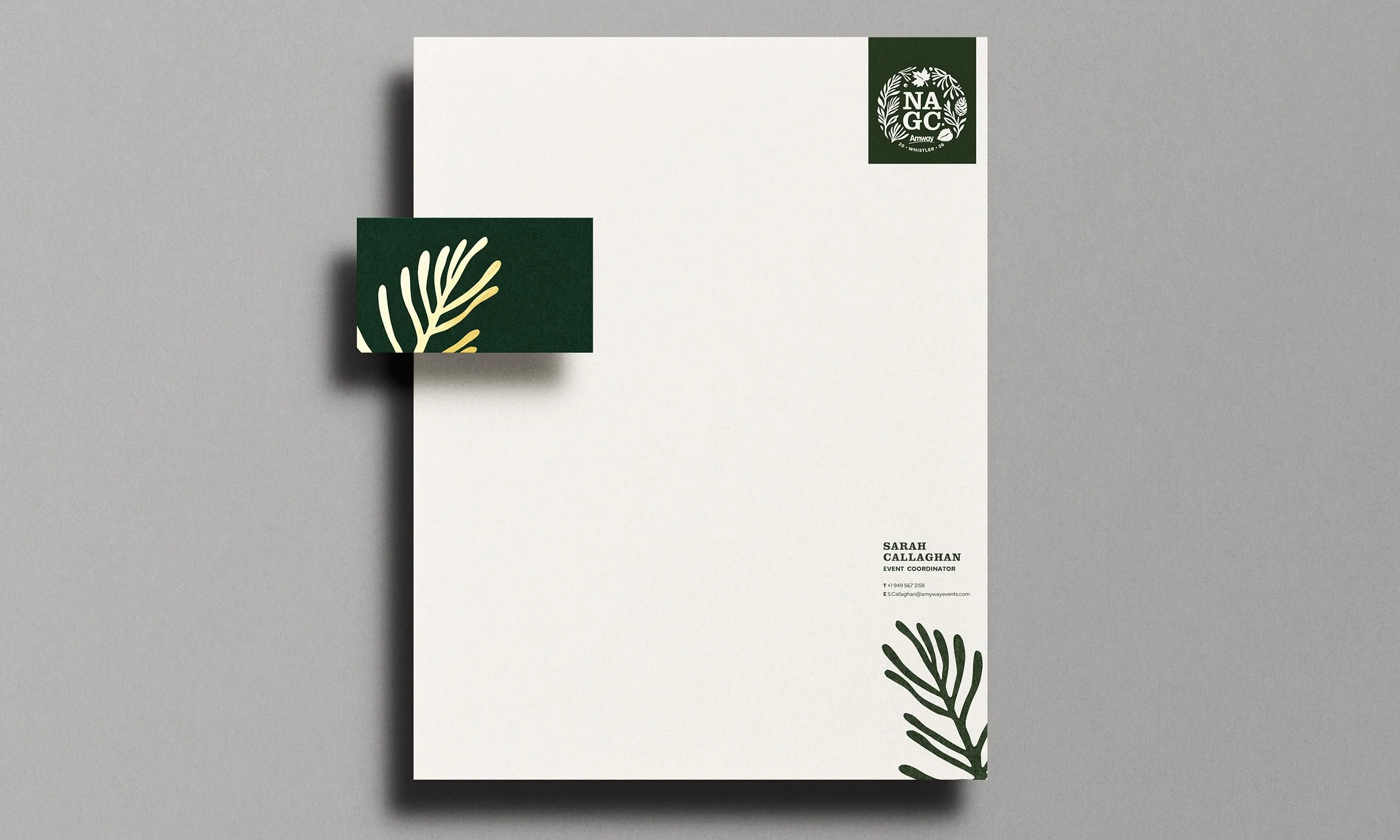
The design system extends across packaging, print, event communications, and a curated collection of branded giveaways. Presented in custom-designed gift boxes, these included chocolate bars, flavored water, tote bags, and pine-scented candles, bringing the sights, scents, and spirit of Whistler into the participant experience.
Together, these elements create a cohesive, immersive brand world that celebrates adventure, connection, and the quiet wisdom found in nature. Amway NAGC Whistler becomes more than an event; it’s a reflection of leadership shaped by experience, growth, and the landscapes that inspire resilience and renewal.