European Launch Campaign For Reebok FloatRide Forever Shoe
Reebok’s Floatride Energy was designed to deliver the explosive energy return of a track spike with the comfort of a cushioned trainer, all at a price that made elite performance accessible to every runner.
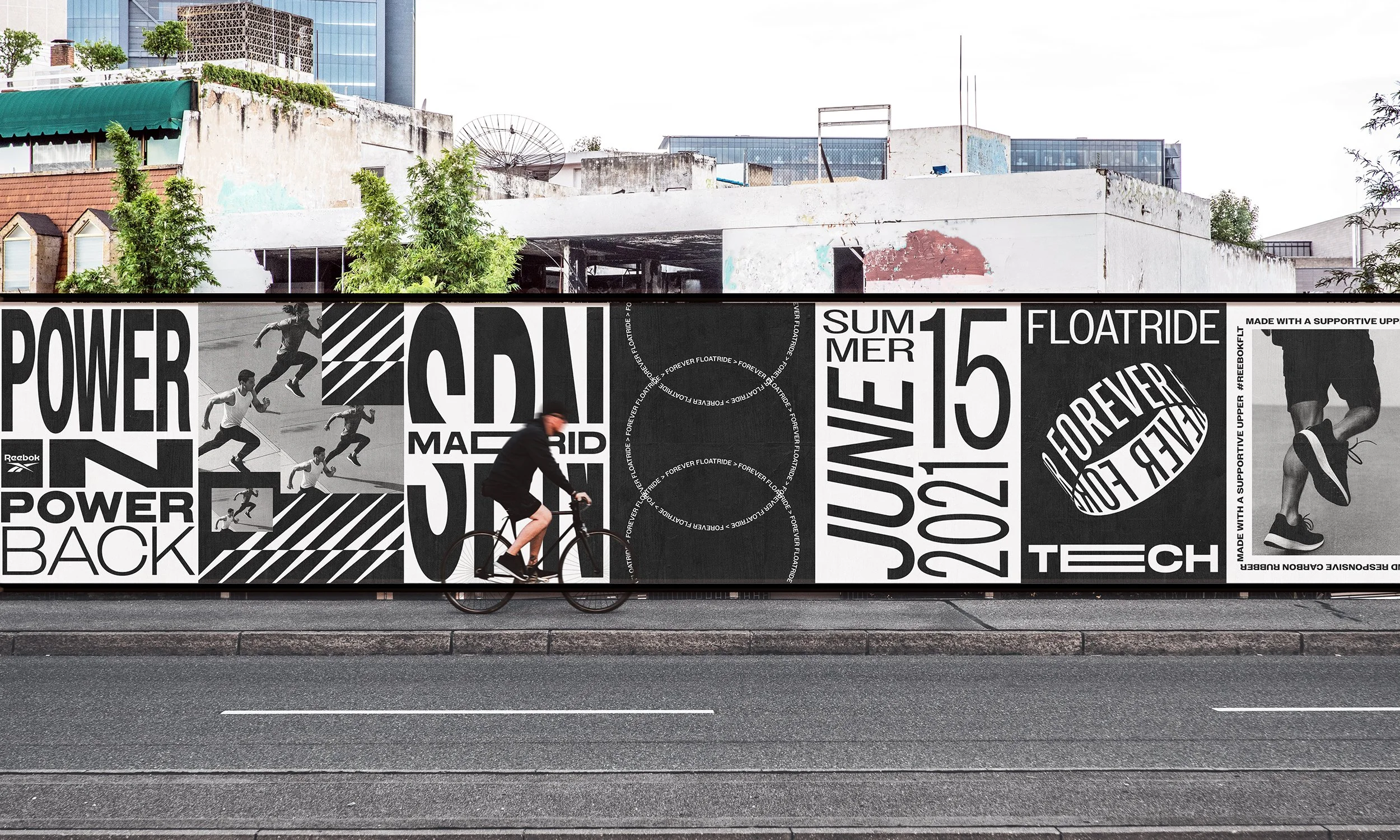
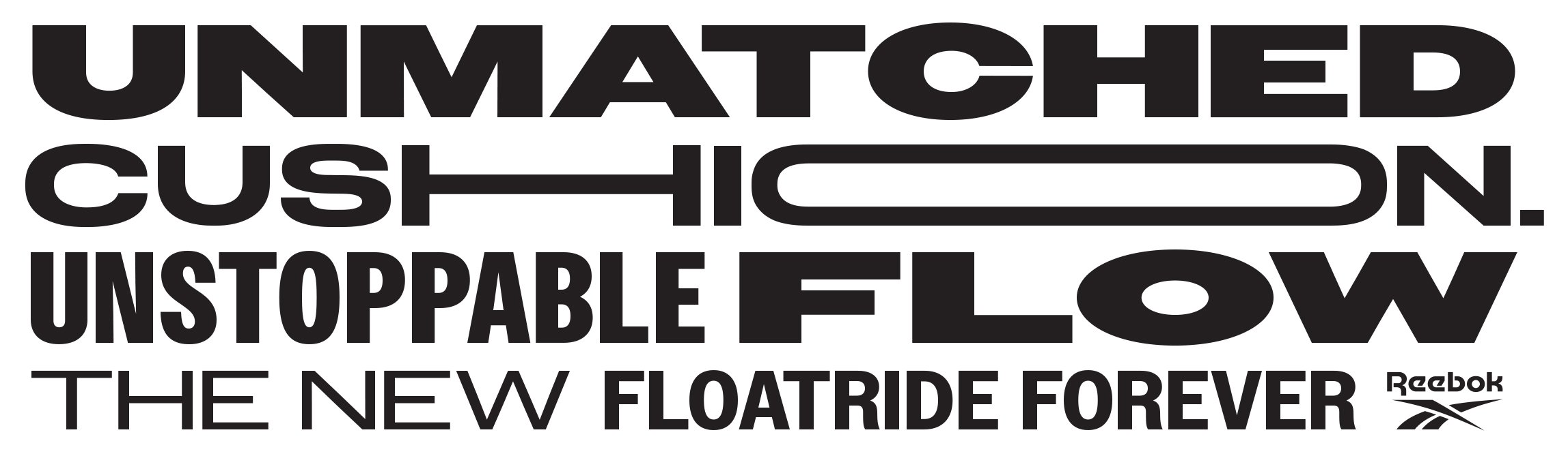
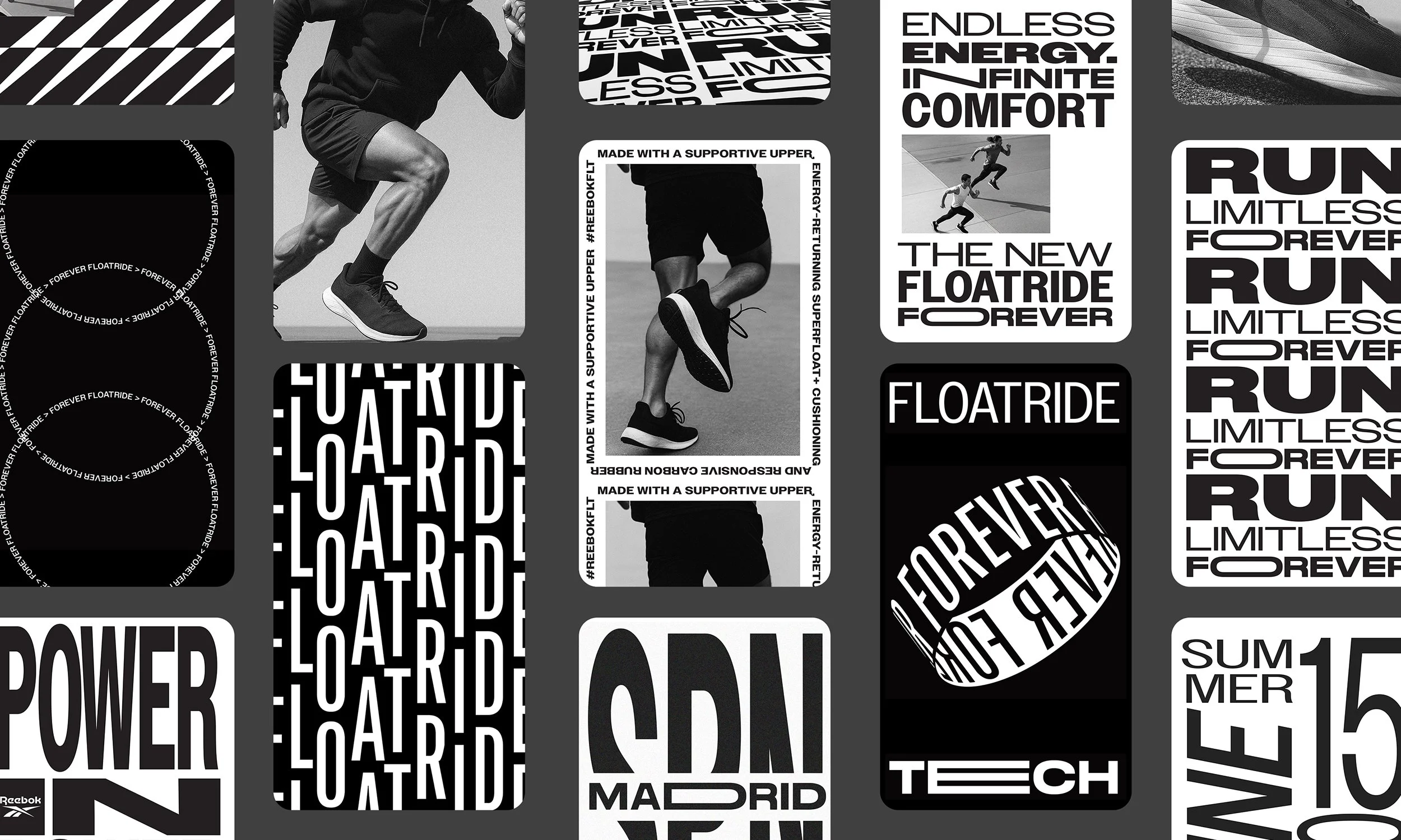
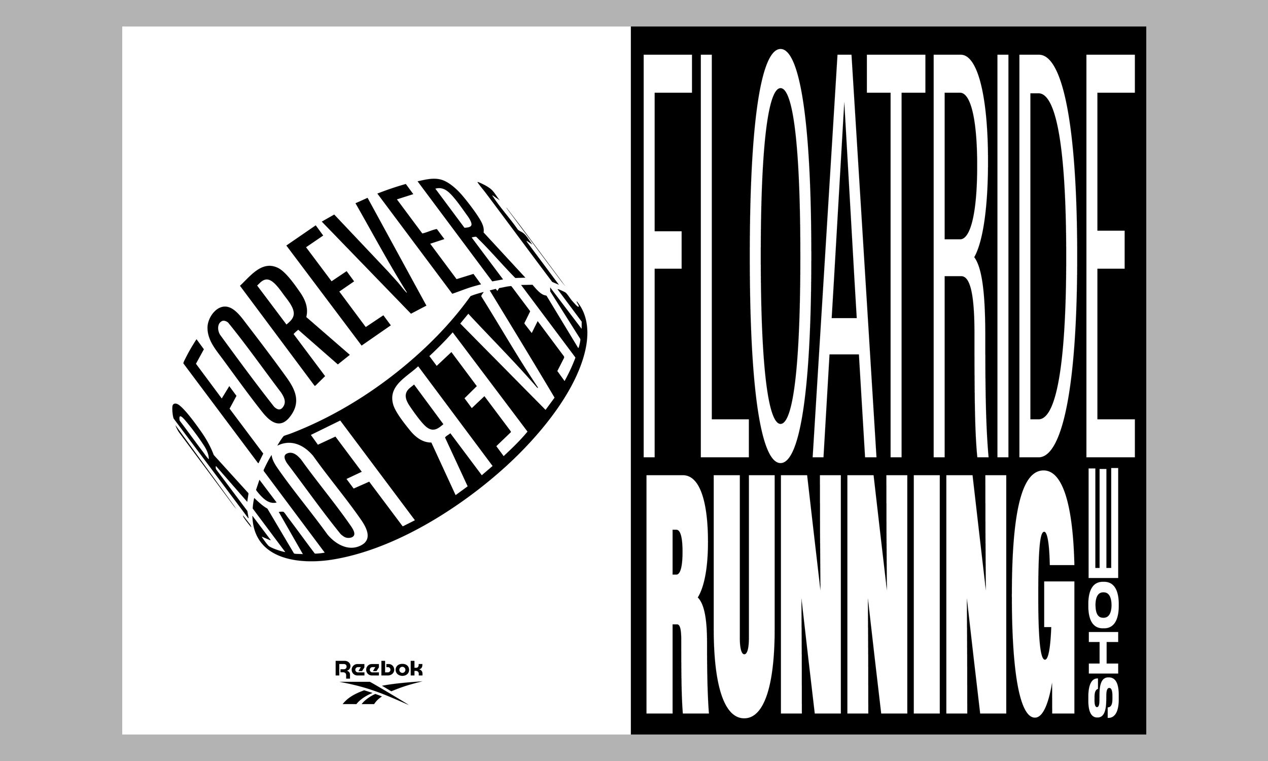
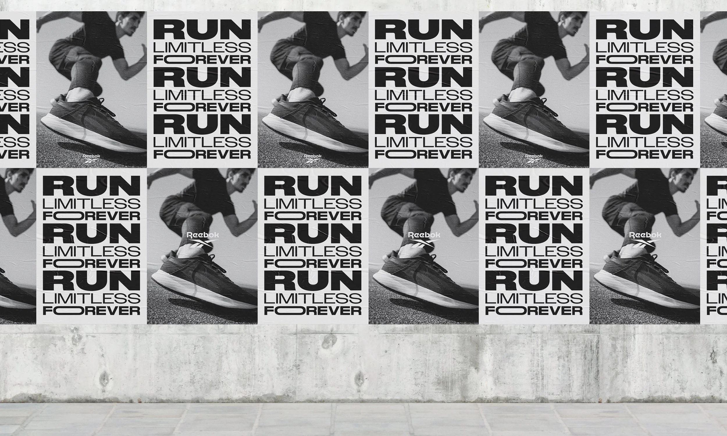
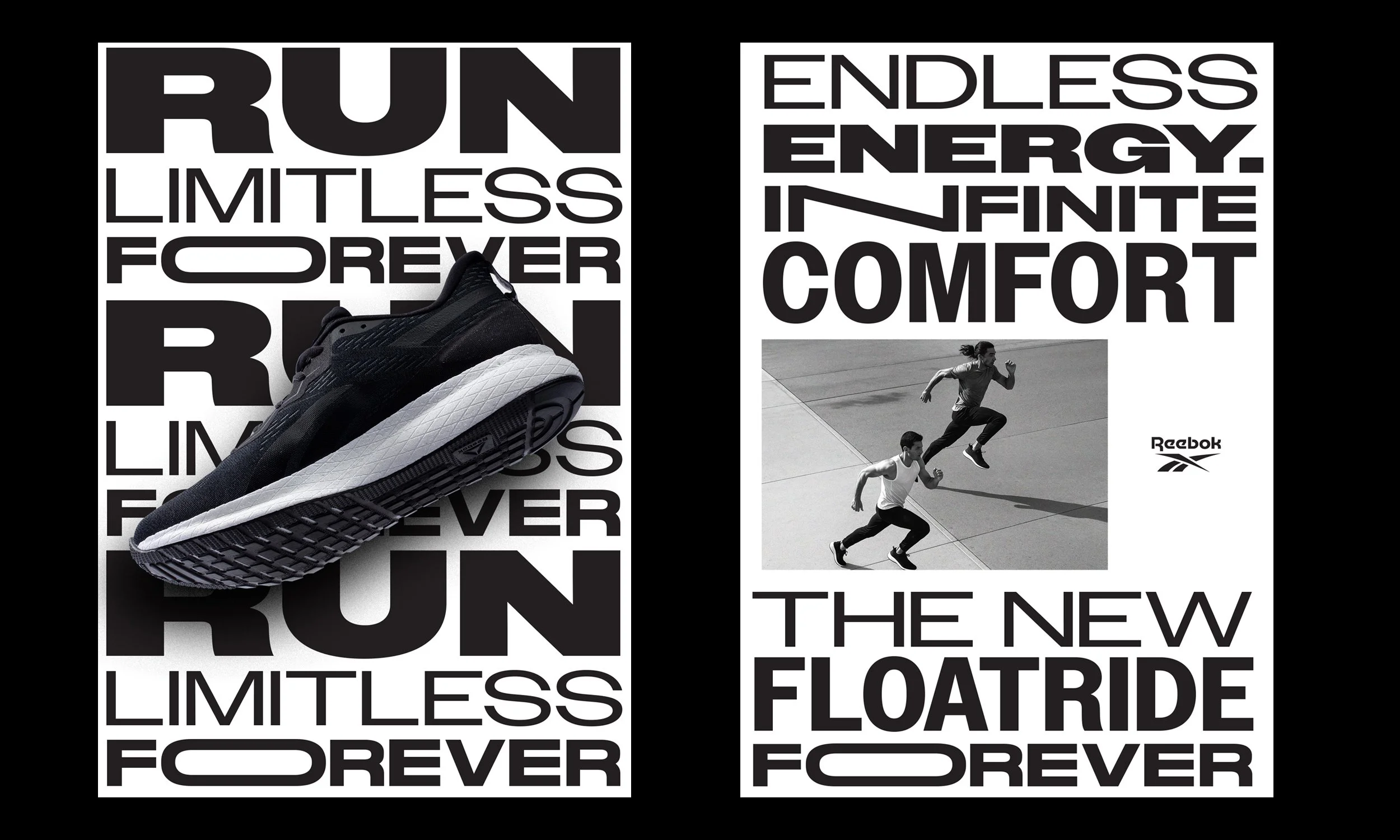
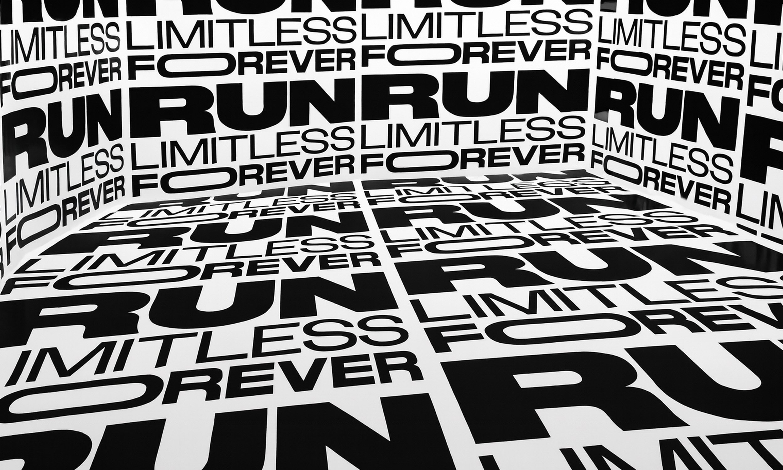
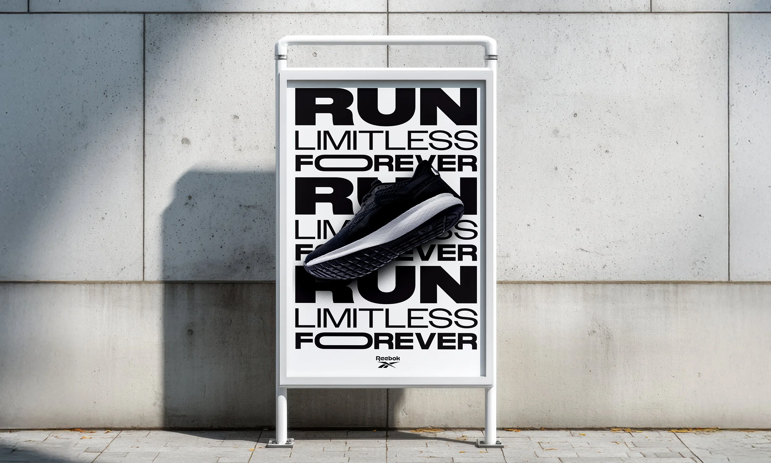
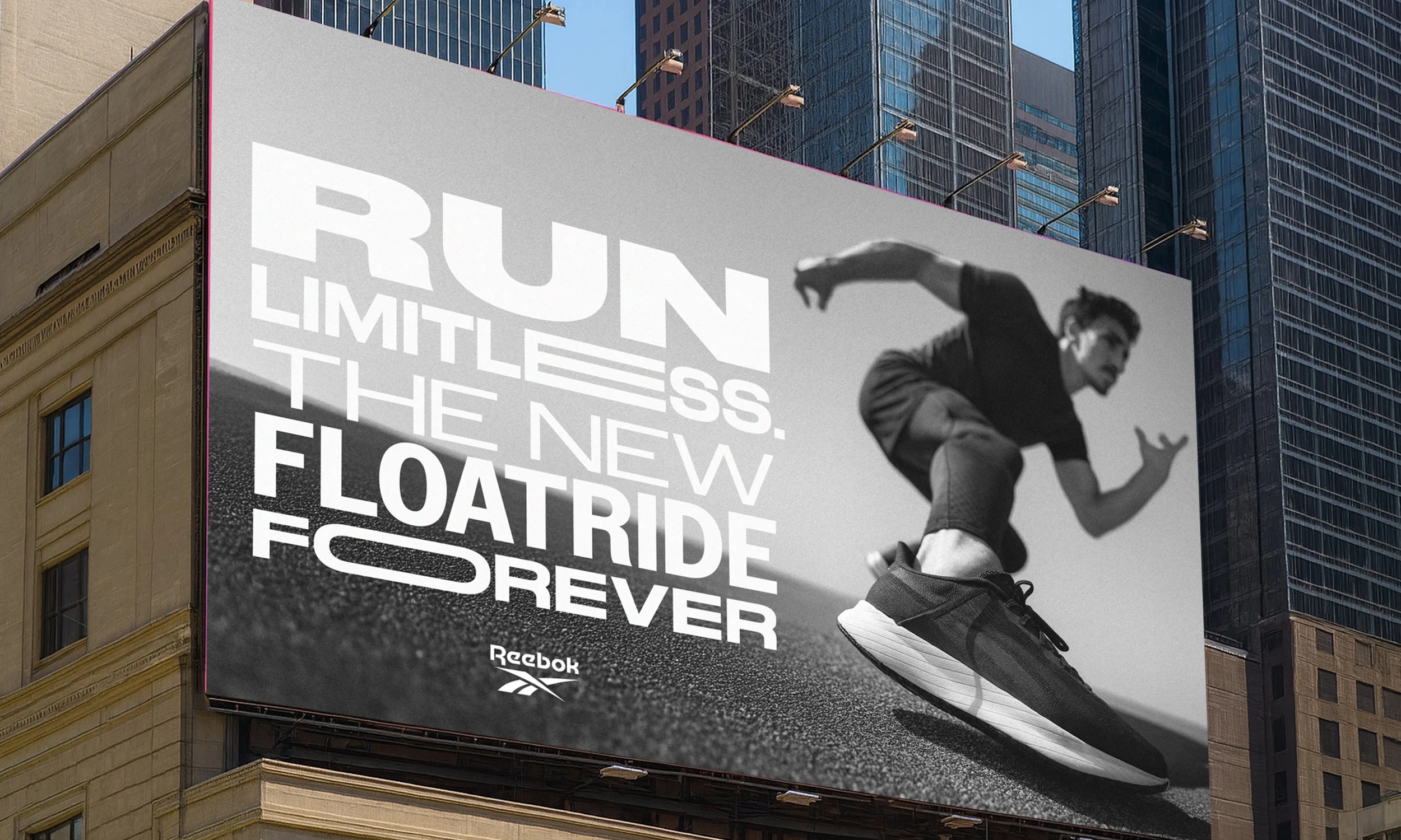
The campaign visualized this dual promise through bold typography, rhythmic repetition, and mirrored motion, reflecting both the shoe’s responsive technology and the cyclical power of energy return. The concept of return became the central idea, a metaphor for performance, persistence, and value.
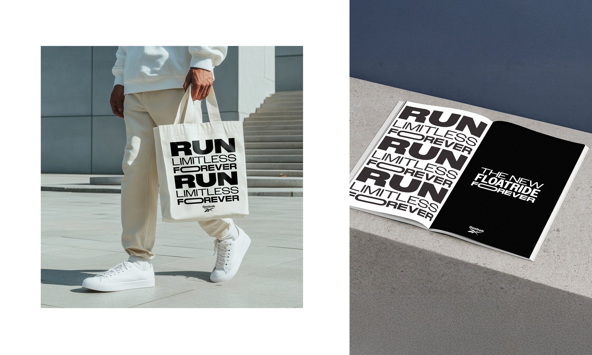
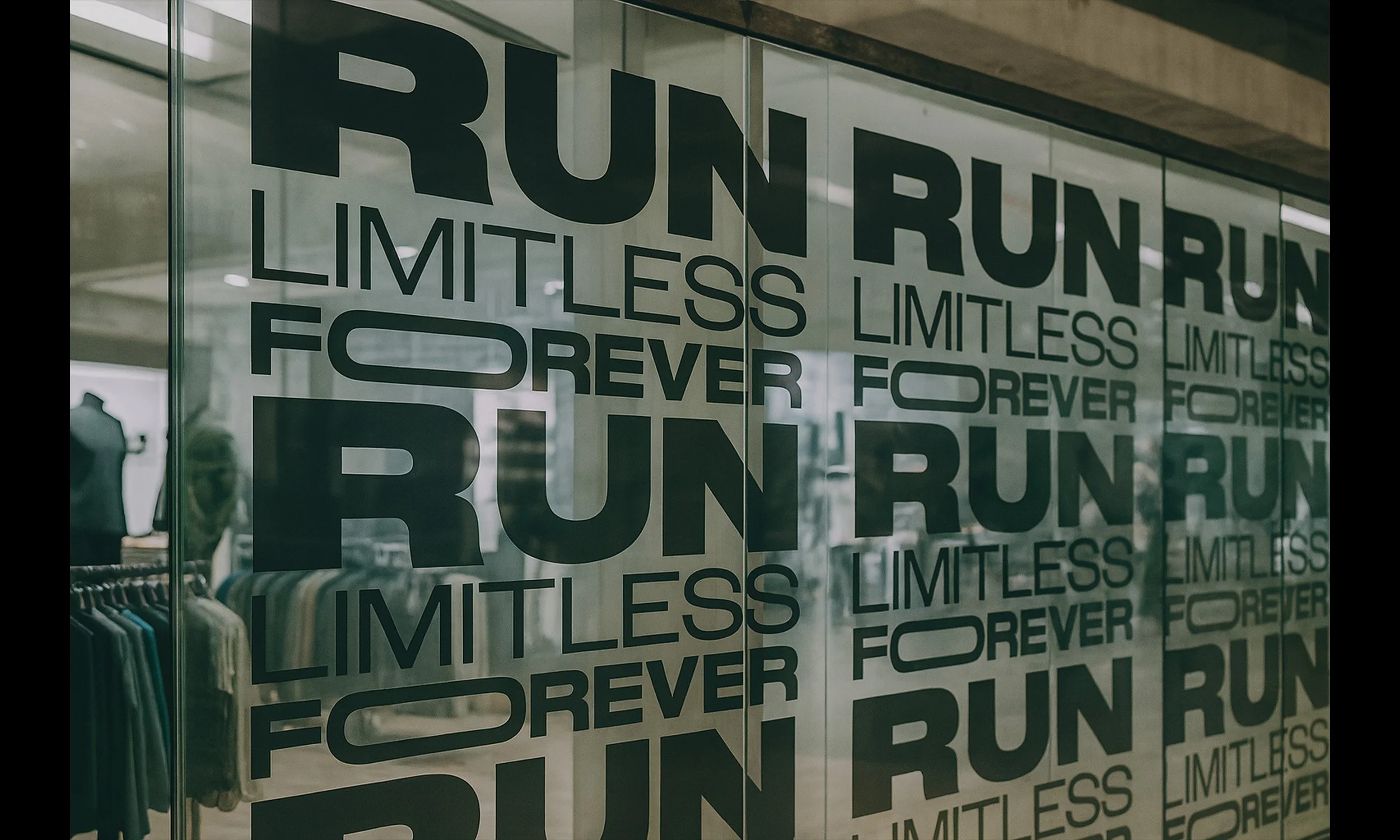
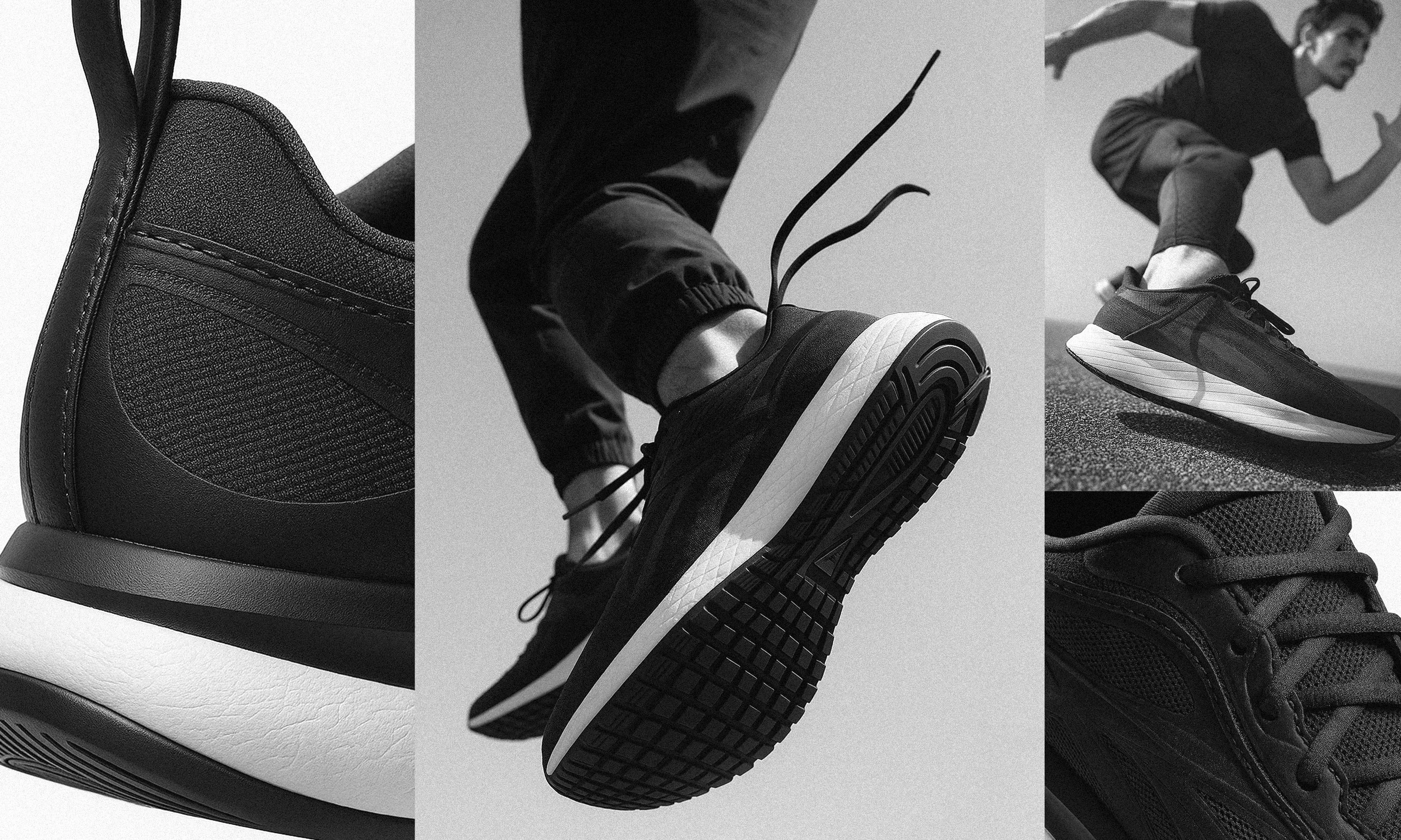
Expansive black-and-white compositions, oversized condensed type, and rotational text treatments amplify the sense of momentum, echoing the continuous cycle of propulsion at the heart of the Floatride experience. Mirrored lettering and looping forms reinforce the idea of energy coming full circle, creating a visual rhythm that feels both engineered and instinctive. Cropped action photography heightens the impression of speed and impact, while geometric structures guide the eye forward, mirroring the runner’s drive.
Minimal yet impactful, the design system relied on strong contrasts, kinetic type, and confident composition. The result was a striking visual identity that captured the precision of performance engineering and the raw emotion of running—proving that in both design and sport, you only get back what you put in.